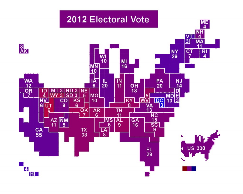
I saw a few graphics shared on Facebook yesterday, where folks had colored each US state and, impressively, each US county, using percentages of red (Romney) and blue (Obama) corresponding to the percentage of the popular vote for each candidate.
While interesting, I don’t like that kind of presentation because it mixes geography with population. Showing, for example, big ol’ sparsely populated Montana, Idaho, and the Dakotas colored according to votes, but not showing their population skews interpretation of the image.
So, I took the Electoral Vote Cartogram by ChrisnHouston on Wikimedia Commons and did the same as mentioned above, using percentages for each state from MSNBC’s and Fox News’ websites. It’s a little rough around the edges, but I thought it’d be fun to post it.


This work is licensed under a Creative Commons Attribution-ShareAlike 3.0 Unported License.
I also put a similarly colored full US electoral cartogram at the lower right reflecting the color of the total popular vote, as well as three squares showing 100% red, 50% red 50% blue, and 100% blue.
